Wednesday, May 24, 2017

typography project

The strongest part of my visual is the different shades of red I used in the apple. I think this is the strongest part because it shows depth within the apple. The top portion of the apple can be improved on because some of it is not filled in with color. Also the leaf can be improved on because it looks flat and it doesn't have depth to it. The tools I used are the type tool. I used different variations of the type tool to create the shape of the apple.

Thursday, May 4, 2017

geometric project


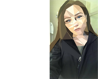
The strongest aspect of my piece is her face. I took my time to create little details such as her eyes and her eyeliner. I think the jacket can be improved. I didn't create the jacket with shapes because it look washed out but if I could created it in different colors. The tools I used to create my project in illustrator were the direct selection tool, the selection tool, the pen tool, the eyedropper tool and the curvature tool. The selection tool would be used to simply click on something while the direct selection tool would be used to highlight a certain area of my work. The pen tool was used to create all of the different sized and shaped triangles, and the curvature tool was used to add any extra anchor points that I needed. The eyedropper tool was used to fill the triangles with a solid color. The easy aspects of this project were filling the triangles with color. Although it was easy to create the triangles themselves I feel as if it is hard to place the triangles and create the right size/shape of triangles in order to accurately represent the piece. If I could redo this project I would 1.) fill the jacket with a different color, and 2.) I would place the triangles differently on her face to make it more of an accurate picture.On a scale of 1-10 I would rate my effort at a 7.5 because I feel as if I could've thought more about the composition of my piece instead of just throwing it together, and again I could've done something with the jacket.

Tuesday, April 11, 2017

The strongest visual aspect of my cartoon is my face. The contrast in colors automatically draws my eyes to the face of my cartoon. Since mostly every other aspect is dark and my face is a light color I view it as the strongest piece of my visual. Also it has the most depth to it. I think that my hoodie and jeans can be improved. I could have used more tools to create a jean and hoodie texture. Since the phone and the hoodie are both black they wash out and blend together making it hard to recognize that there is a phone there. The tools I used to create my piece of art work were the paint brush, quick selection, dodge and burn tools, and the eyedropper tool. I used the paint brush and quick selection tool to select the area(s) I wanted to be a specific color followed by using the paint brush tool to obtain the correct color and fill the area in with it. I used the dodge and burn tool to add depth to my face so it didn't look like a flat surface. I found tracing and scanning in my picture was the easiest aspect of this project. The most difficult being actually creating, shaping, coloring, and outlining my image. I find photoshop to be confusing and hard to understand at times. I would rate my overall effort grade from 1-10 is 7. I could have put more effort into the shading of my cartoon.